An iOS app that helps you choose recipes, whatever your mood, whatever is in your kitchen.
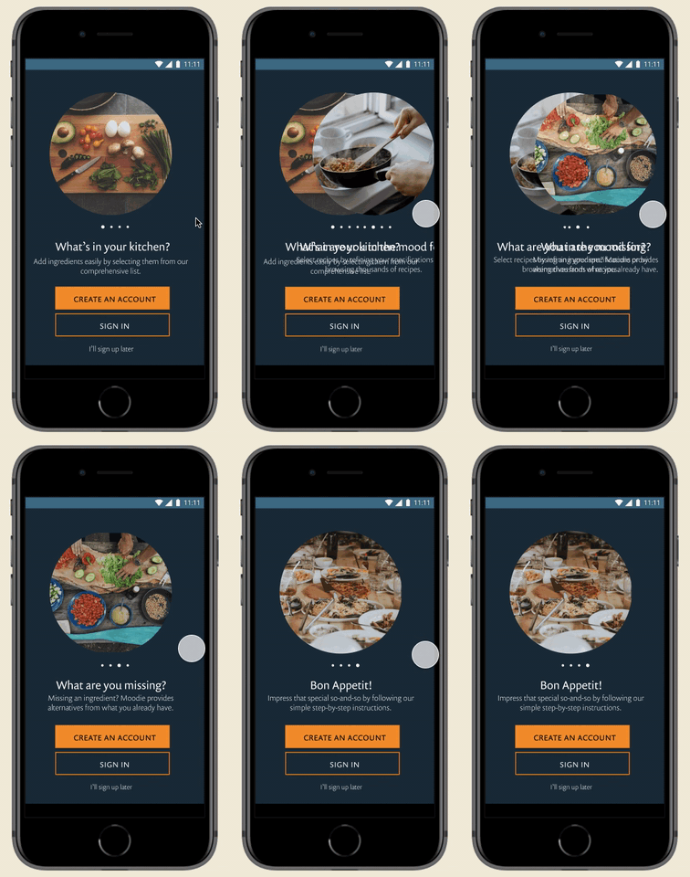

An iOS app that helps you choose recipes, whatever your mood, whatever is in your kitchen.

Research
Information Architecture
Interaction Design
Draw.io
Figma
Invision
Clickable Prototype
High-fidelity Mockups
Finding new recipes is a crapshoot.
For those of us fortunate enough to have the luxury of choice, the process of thinking about, searching for, and executing daily meals can be an exercise in frustration. Long-winded instructions preceded by grandma's life story, recipes with obscure ingredients, and the paralysis of choice are just a few pain points, as I discovered in my research.

A recipe app that gets straight to the point
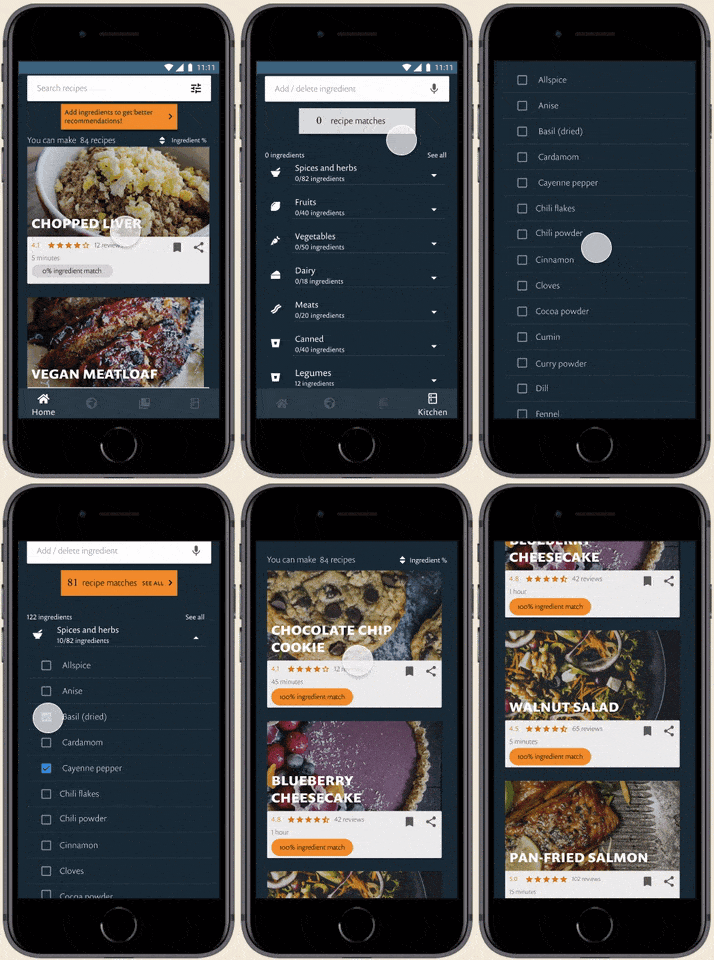
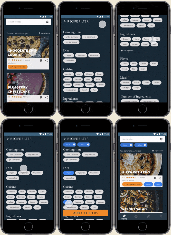
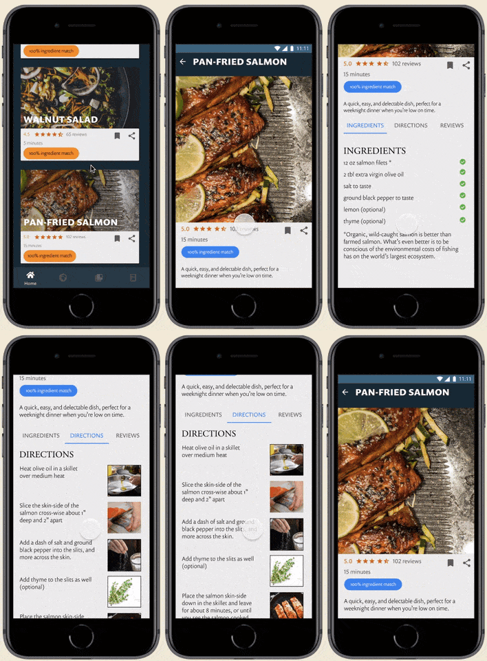
The guessing game ends with Moodie. Simply input the ingredients in your kitchen, specify your cravings with Moodie's filters, and browse catered lists with just ingredients and a step-by-step recipe.
Analyzing the competitive market
To get a feel for the competitive landscape, I analyzed three recipe apps: Yummly, RecipeKeeper, and Epicurious. Yummly and Epicurious are keepers of thousands of recipes, both a blessing and a burden. RecipeKeeper is a way of storing your own recipes -- a personalized cookbook as it were.
An opportunity existed for an app without the bloat or clutter of apps with lots of recipes.



Deciding what to cook
What motivates a decision as constant and important as what to cook? I wanted to figure out how homecooks decide upon a recipe, what methods they use to find new recipes, and what pain points come up when going through such a process.
95% cook every day or several times a week
70% are mainly motivated by making delicious dishes
40% dislike overly wordy recipes
77% decide on a recipes based on ingredients already in their kitchen
70% say their choice is dictated by their mood
73% find recipes on blogs and social media
Defining the target audience
I interviewed six users, all self-identified as intermediate amateur cooks, all of the millennial generation. At this point, I knew that my target audience wouldn't be those who don't know the difference between vinegar and vinegarette, i.e. beginner cooks. With the data, I created two personas.

Data analyst
25
A new recipe a week
Develop new cooking skills
Choice paralysis
Christina enjoys cooking. When it comes to daily meals, she hates eating the same thing, but also hates not knowing what to make. Though she has her regular rotation, she wants a mix of new recipes every week.

Cinematographer
35
Reduce excess and waste
Share delicious meals
Spoiled food
Quinn always feels constrained by time. This doesn't keep him from cooking nearly every night of the week. His goal is to be 100% efficient, both with his time and with using all the food he buys.
Prioritizing the needs of users
After compiling all the research, I distilled the main needs into three high-priority items. All the high and medium priorities made it to the MVP.

I want acccess to new and delicious recipes so I can find one to make
I want to filter recipes based on my mood so I can find something I'm craving at that moment
I want to find recipes based on the ingredients I already have so I don't have to go shopping
I want to save recipes I enjoyed so I can make them again
I want to experiment with different flavor combinations so I can make delicious foods
I want to find succinct recipes so that I don't have waste time
I want to know how long a dish will take so I know if I have time to make it
I want to find and share recipes through social media
I want to see serving sizes so I can cook enough food for the people I'm with
I want to find simliar recipes to the ones that I enjoyed so I can cook similar foods
Figuring out the when and where to input a time-consuming task
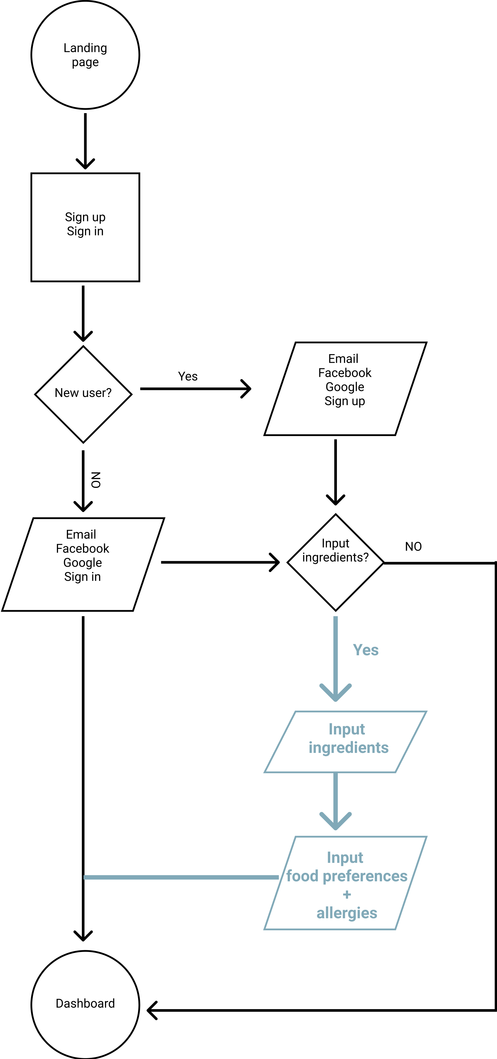
The most challenging aspect of the flow was figuring out when and how to get users to input ingredients.
In the original user flows, this step was an optional part of the onboarding process. As you can see, if users opted to input them, a daunting task is dumped at their feet, even before accessing the main dashboard.
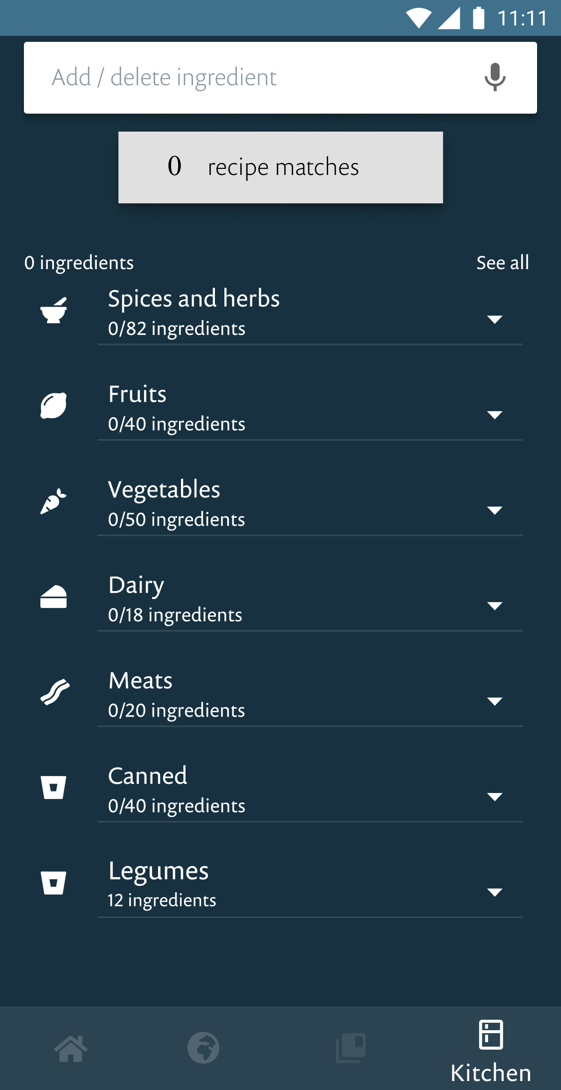
I would learn the error of my ways in testing. The new flow would eventually get rid of this linear progression of adding ingredients, and put it all into one screen.

Organizing the elements into an intuitive UI
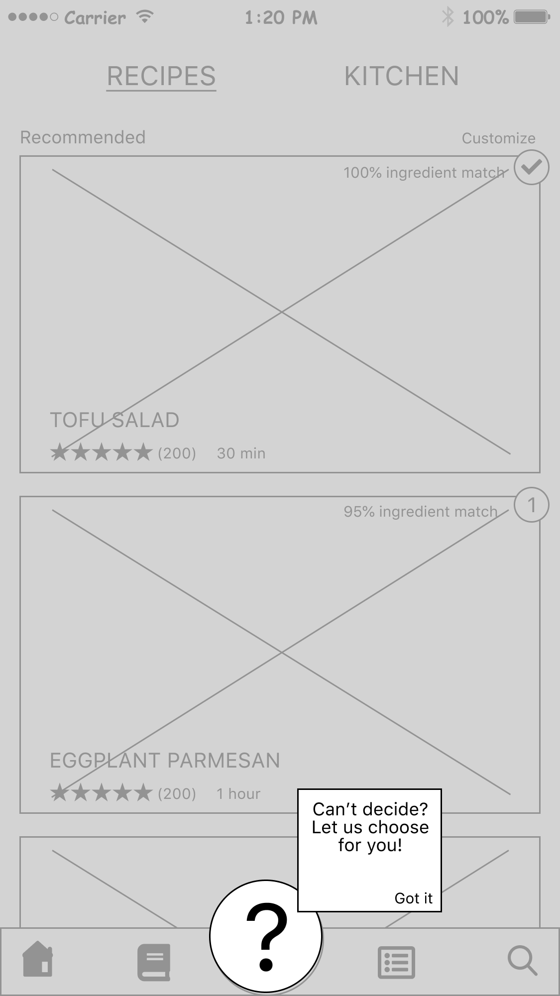
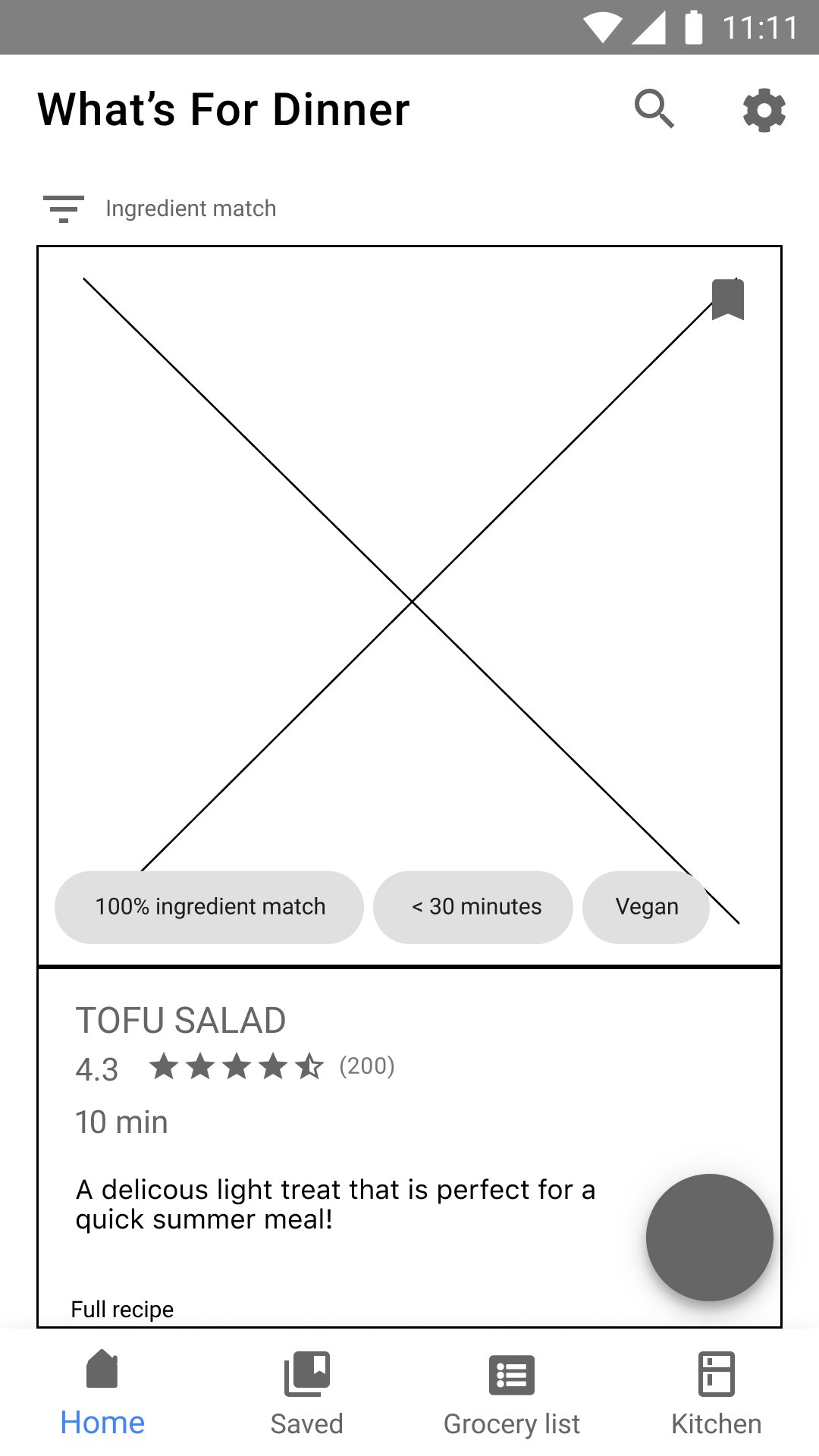
As I designed the wireframes, there were two looming questions on my mind. The first was the aforementioned process on ingredient input. The next was incorporating two high-level actions onto the dashboard, both equally important but markedly distinct. My original plan for the latter was to create a floating action button.

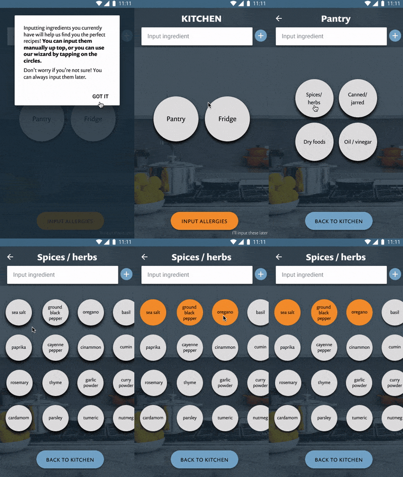
Onboarding as whack-a-mole
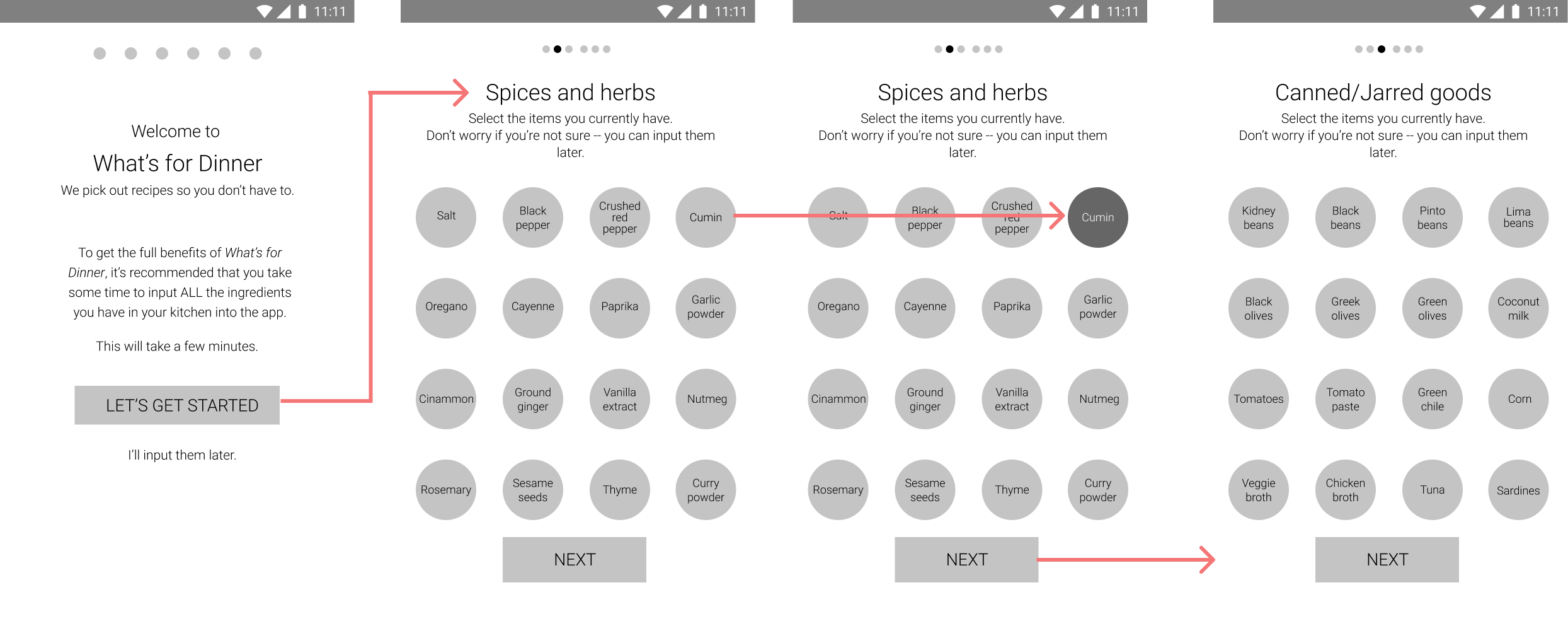
I hypothesized that by making the onboarding process into a type of whack-a-mole game in which users just touch the ingredients they have, the process would be more enjoyable.
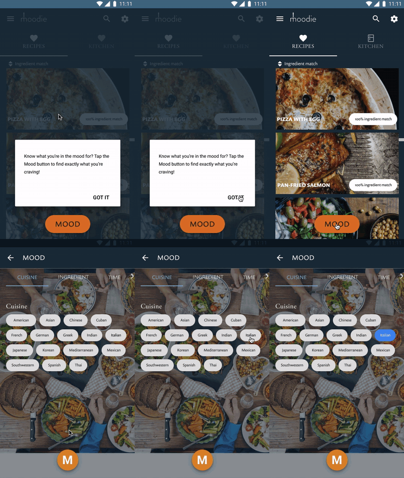
Making a lasting impression
The idea of a floating action button felt practical and unique. There were two main reasons why I pursued this design:
Finding out that both my solutions were problematic
The onboarding process had a success rate of 0%. Yep.
There were two main issues: the suddenness of the daunting task, and the lack of progression. Users were all confused whether they HAD to input all the ingredients right away. Additionally, because the process didn't have a linear flow, users didn't know what to do after they inputted ingredients.
It wasn't exactly clear to users what the mood button did and how it worked. And though 40% of participants enjoyed the look and feel of it, the rest did not care much for it.

Creating a more sophisticated palette
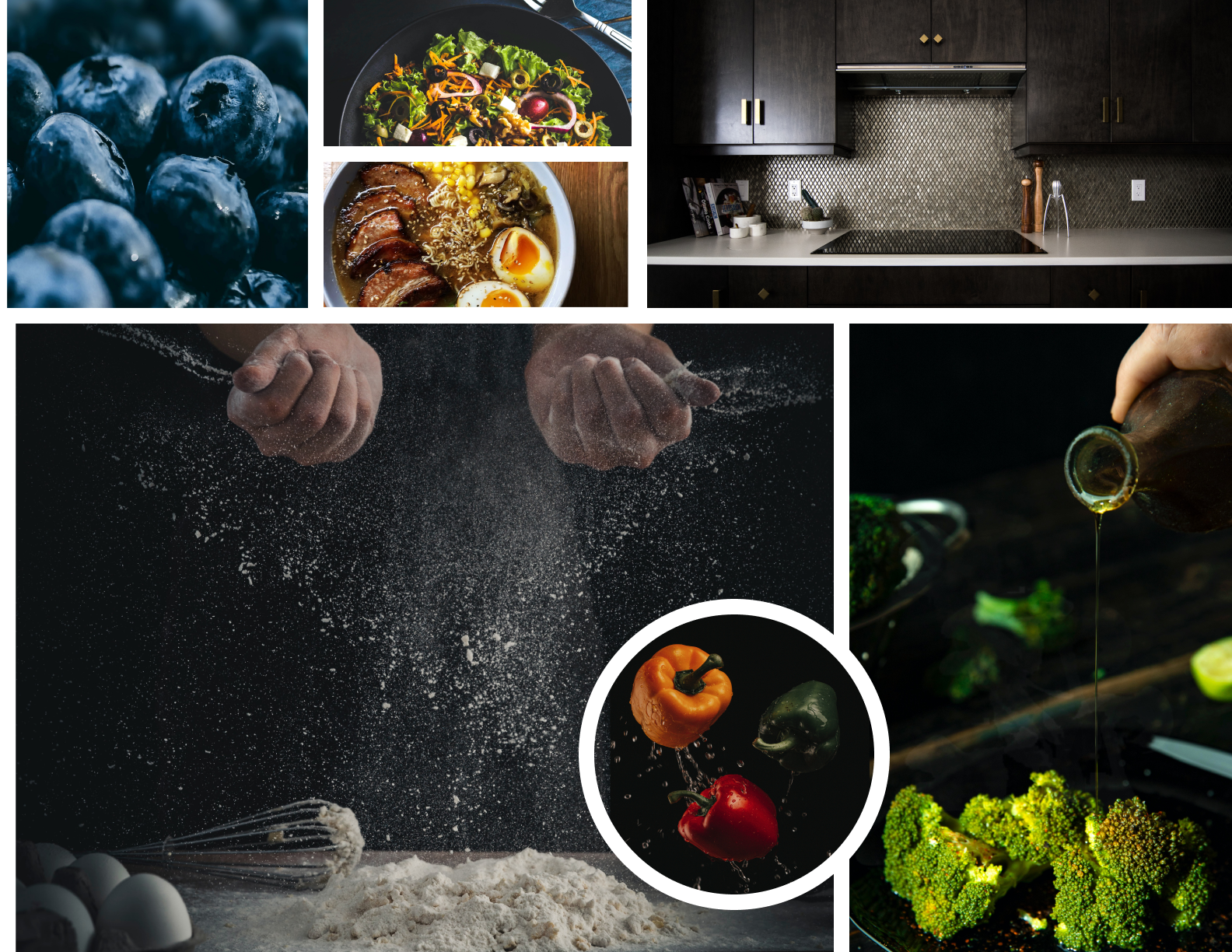
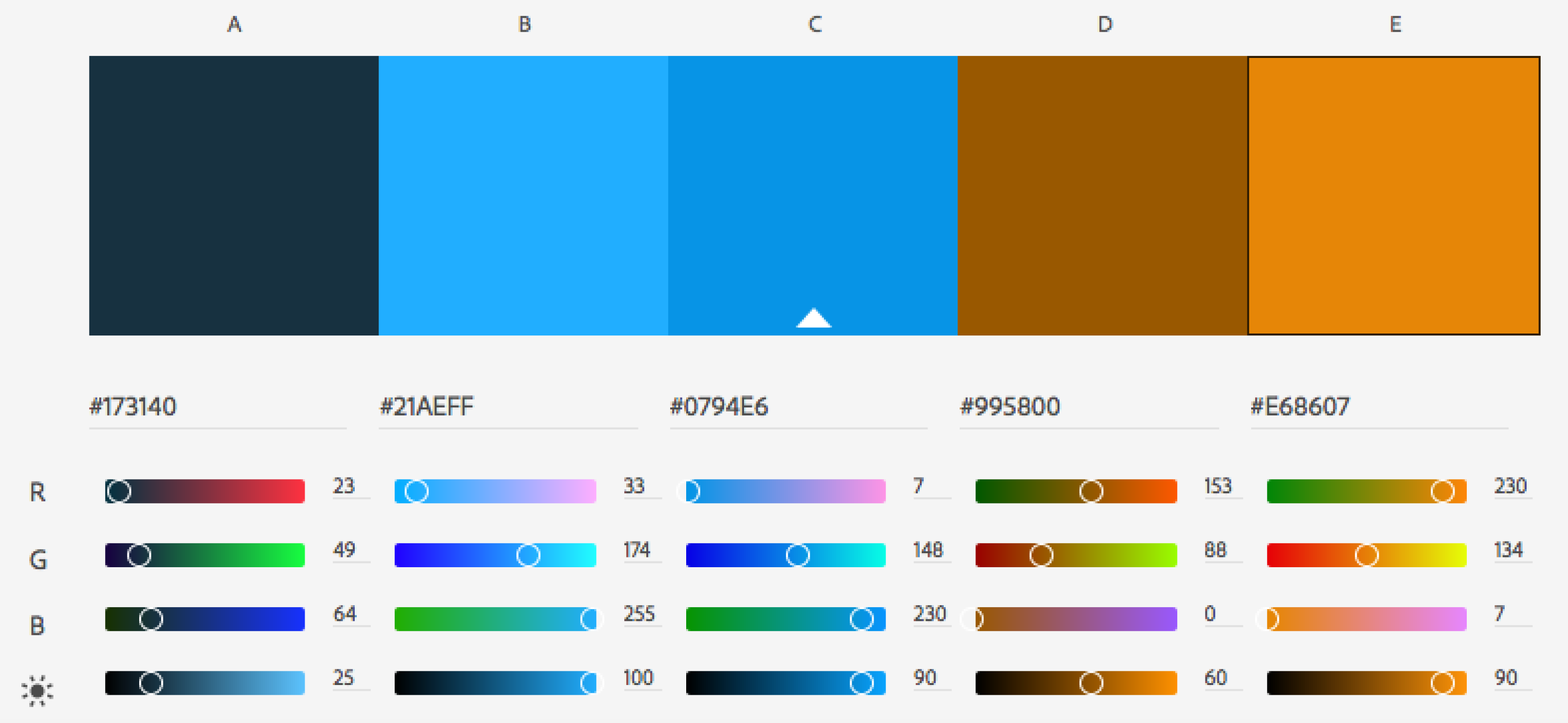
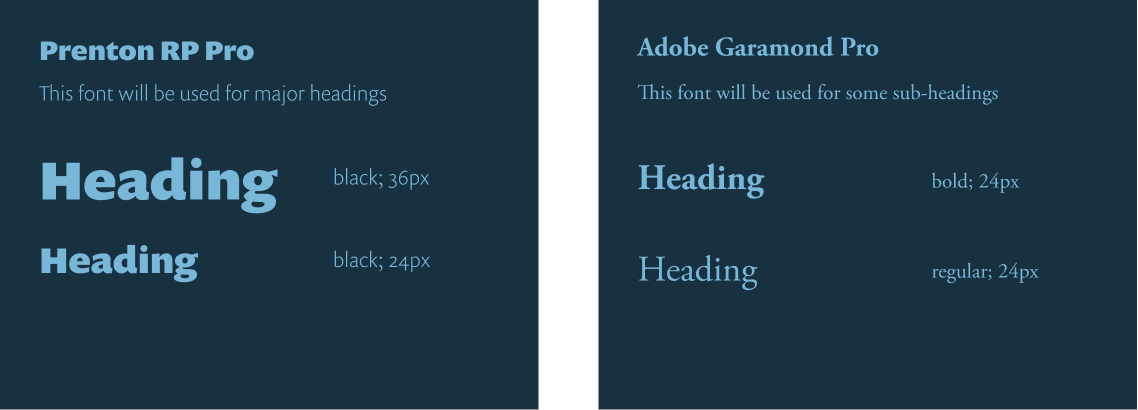
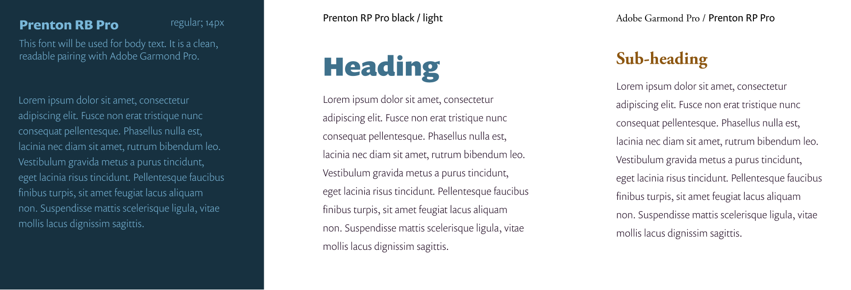
I wanted Moodie to appeal to more seasoned home cooks. I opted for darker tones, creating a more sophisticated vibe. All other visual choices followed this theme.

PREFERENCE TESTING
The first preference test I performed had to do with the images of food. The images of the food is just as important as the food itself, according to several of survey participants. I wanted to test how big users liked their images.
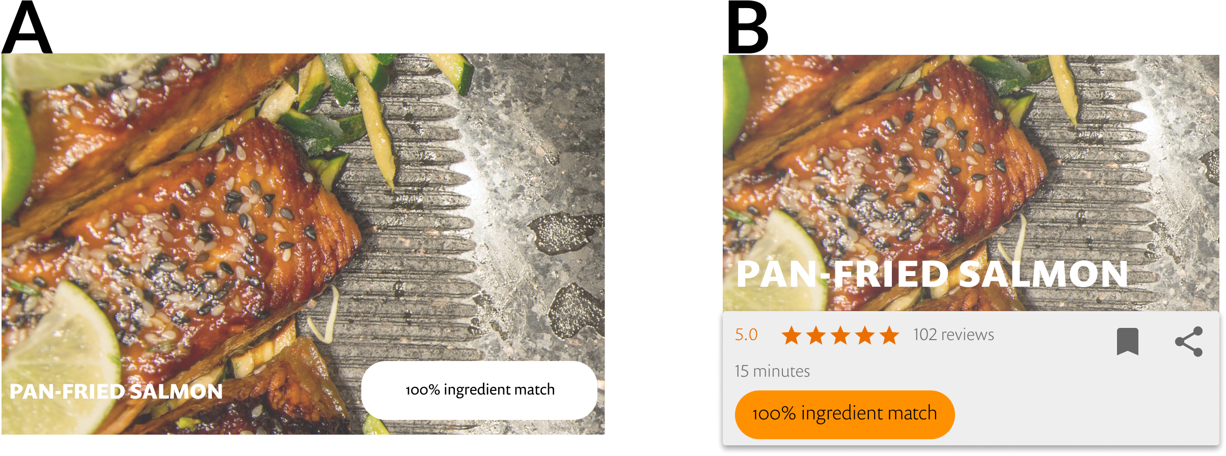
Within these choices, B was the winner with a vote of 60%. It provided more relevant information. Details were also much easier to read.
I learned two important lessons from this product.
1. Don't expect the user to do any heavy lifting right away.
Even the most enthuastic of users will lose interest real quick. To put it another way...it's a total mood-killer.
2. Be practical.
I wanted Moodie to stand out from the competition. A floating action MOOD button seemed like a perfect idea. I cherised the idea like Gollum and his ring, so it was a rude awakening when most users couldn't make sense of it. I had a choice: I could hold onto the idea as it fell into the depths of Mordor...or I could come up with a sensible solution.
A filter button was the sensible solution. No pizzazz, maybe even pedestrian, but it worked.
Don’t try to reinvent the wheel. Yet.