
In an increasingly digital world, pen and paper are still king to the educators, tutors, and students who teach and study English. Enbox is looking to transport the industry into the 21st century and beyond.

In an increasingly digital world, pen and paper are still king to the educators, tutors, and students who teach and study English. Enbox is looking to transport the industry into the 21st century and beyond.
Research
Information Architecture
Interaction Design
Draw.io
Figma
Invision
Clickable Prototype
High-fidelity Mockups
Finding a three-fold problem in the world of adult ESL.

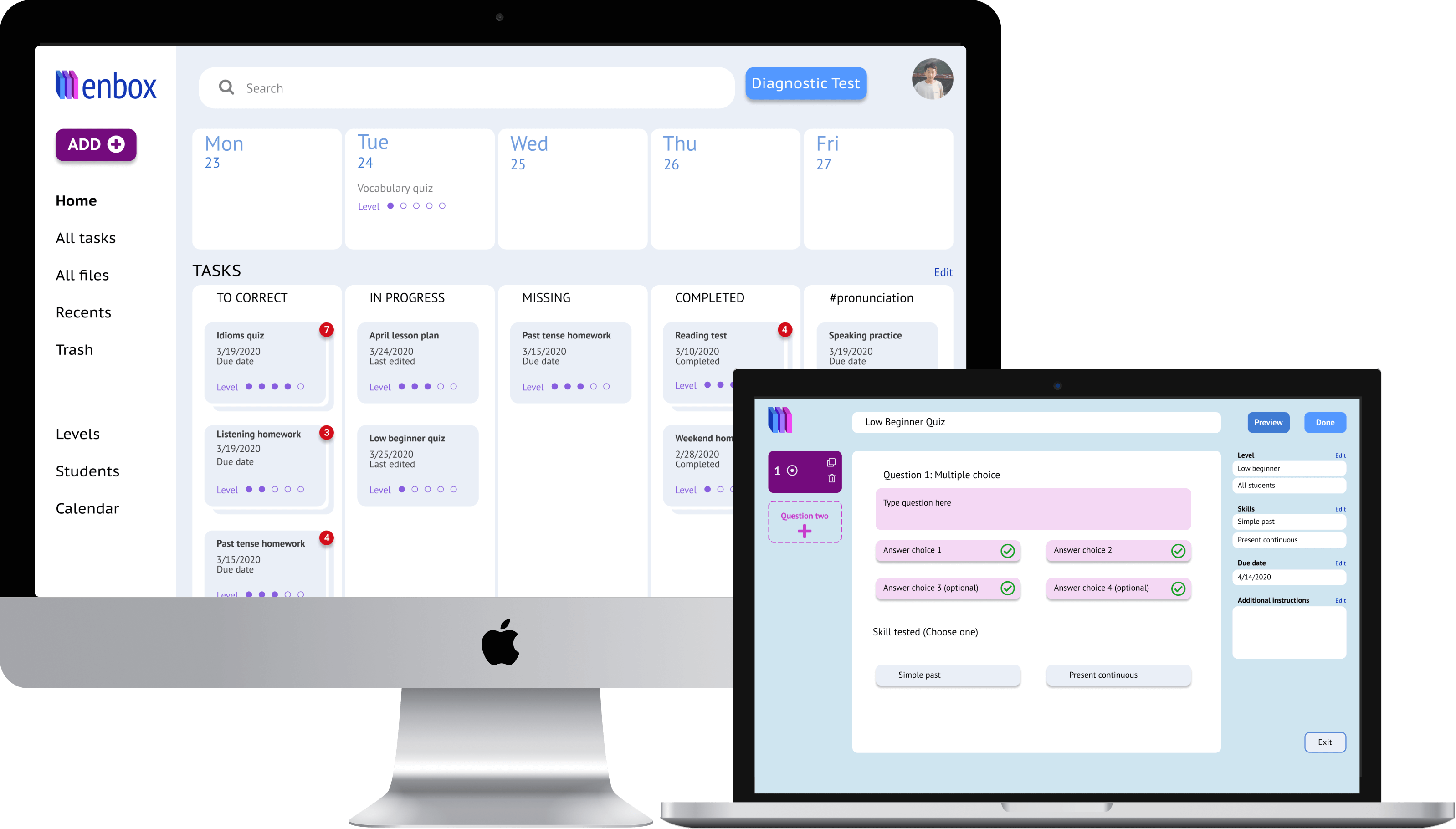
A minimal, intuitive interface where teachers can create and categorize original content.
;
Analyzing the competitive market
I conducted a SWOT analysis on Google Classroom, Dropbox, and Notion. Though these products offer quality services, an opportunity is open to catering to the world of adult ESL.



User research was focused on ESL teachers. I sent the surveys to current and former colleagues of mine. The following are some numbers that stood out.
use Google Drive as their primary cloud service.
cited “convenience” as the main factor in using their preferred cloud storage service.
wanted a product that allowed for the creation of original content.
I interviewed colleagues of mine and created two user personas.

English Teacher
34
Be more digitally organized with her documents
Losing track of files and recreating the same documents again
Megan is the most organized teacher in her school. She has binders of lesson plans and activites that she's collected over the years. The main reason she hasn't switched to digital is that she can't stand the disorganization of her current digital system, so she sticks to paper for now.

English Teacher
27
Improve his teaching
Have more time to focus on students
Rushing through corrections
Difficulty finding specific files
Nicholas is an excellent teacher. He cares deeply about his job and his students, even the slack-jawed yokels. He wants to have more time and focus for individual students, but with the surfeit of lesson plans, activities, corrections, and assessments on his plate, he has little time much else.
Making a flawed assumption
As I prioritized the navigational and actionable elements of my product, the classroom was always front and center. This assumption, borne out of my own personal experience, would become a barrier rather than a pathway.

I want to create classrooms
I want to create new assignments/ documents/ spreadsheets
I want to upload files and folders from my personal devices
I want quick and easy access to my files
I want to import documents from my computer
I want to organize files efficiently
I want to organize files conveniently
I want to tag files
I want a reminder for upcoming tasks
I want to share files with others
I want others to share files with me
Designing around this flawed assumption
My initial user flows also reflected a classroom-centric setup. All roads went through the classroom. This also proved to be a simple fix... I eliminated classrooms altogether.

Changing course
After getting rid of my classroom-first theory, I developed a dashboard with a task-based focus. It allowed for quick access to high-priority files which would be both time-efficient and convenient.

From sketch to wireframe, the to-do list was just a small part of the dashboard. In testing, this would prove to be problematic. 75% of teachers would express confusion at the lack of information hierarchy. As you will see in the mockups, the to-do list was later transformed to have a more prominent presence.

All the paper used for the classroom-centric wireframe sketches. Oh, the irony...
Emphasizing the to-do list
The to-do list got a huge upgrade from the original wireframe on the left, to the newer version on the right. Now there was no question about what was most important.

Quiz troubles
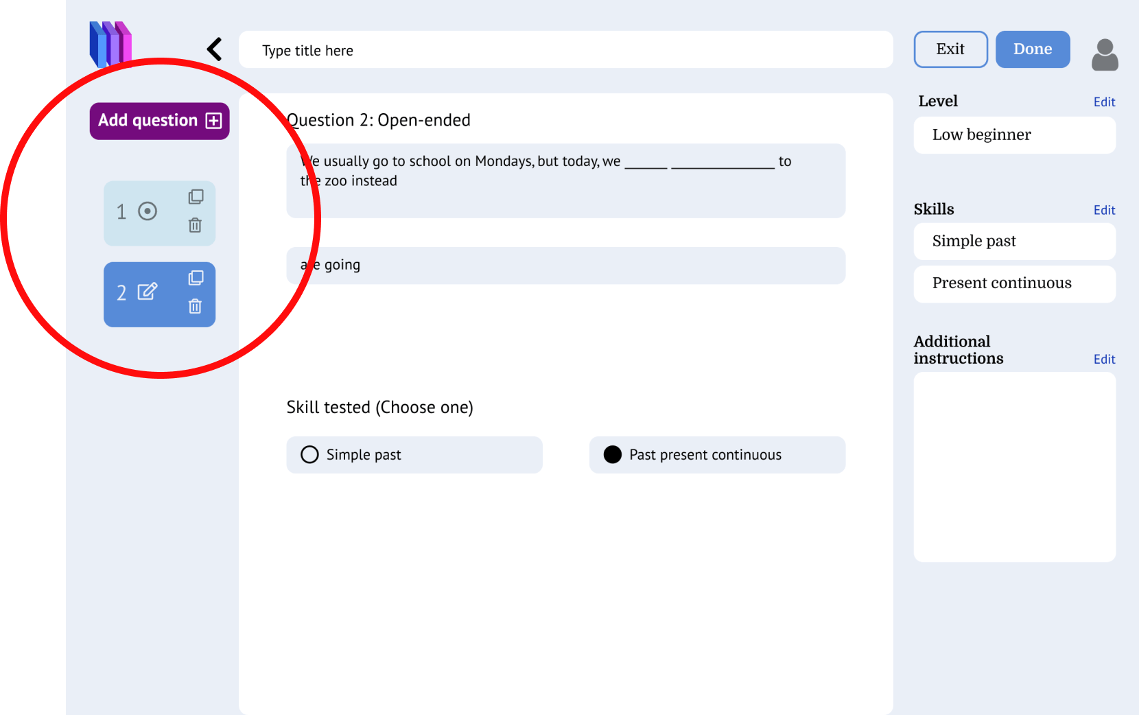
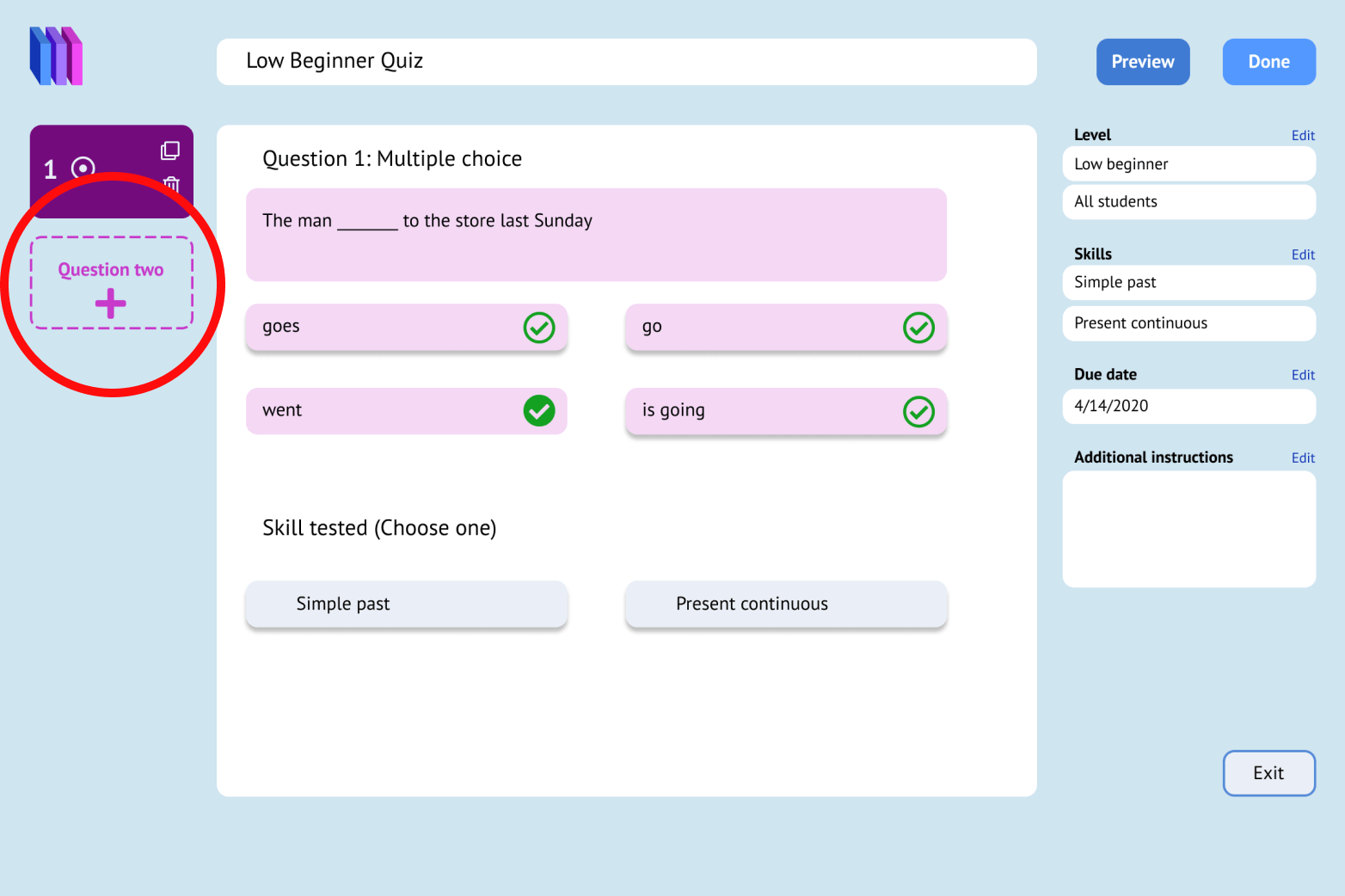
Though users understood how to make questions, over 50% expressed confusion over the navigation of the test. They didn't understand that the left column was the navbar, so to speak.
By omitting the "add question" button and instead creating the question outline, more users then understood that they could switch between questions from the left-hand navigation.
Striking a balance
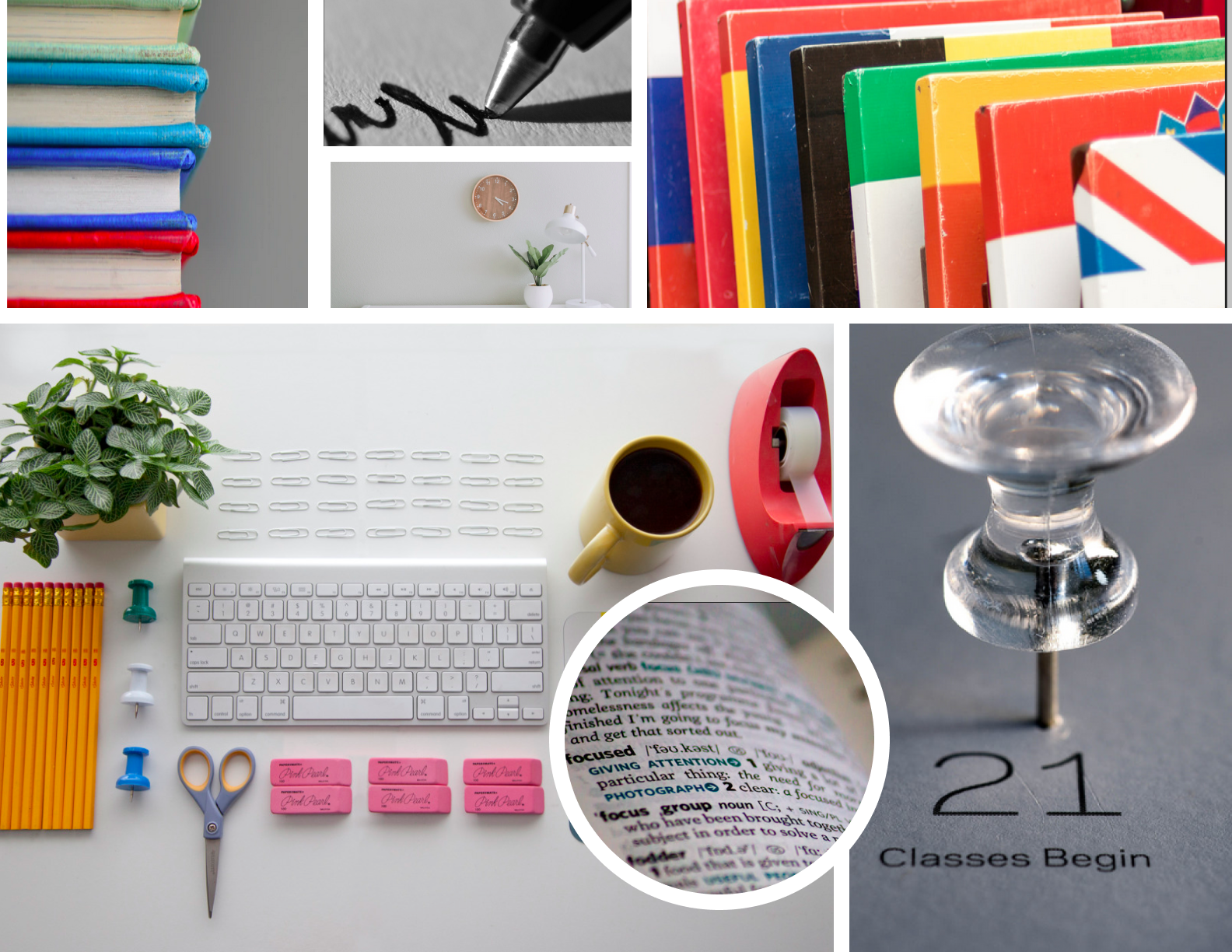
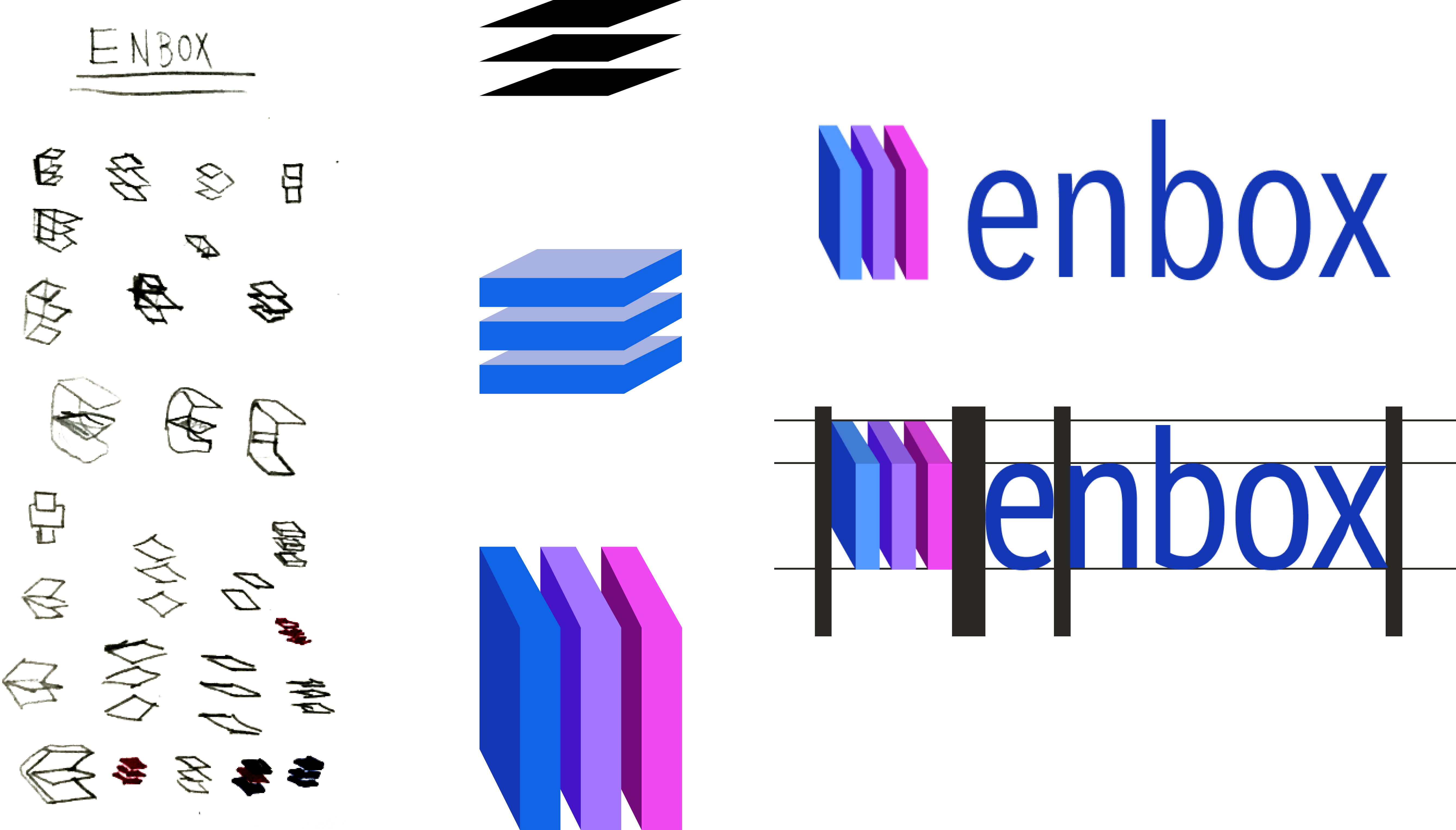
Enbox is essentially a filing system for instructors. I wanted to strike a balance between the professionalism of adult education with the youthfulness of a classroom.

A B C D E F G H I J K L M N O P Q R S T U V W X Y Z a b c d e f g h i j k l m n o p q r s t u v w x y z ! @ # $ % ^ * ( ) _ + ; : ‘ “ , < . > / ?
The first element I tested was the to-do list. I had initially envisioned that icons would represent the task that needed doing, e.g. exclamation point = high-priority item.
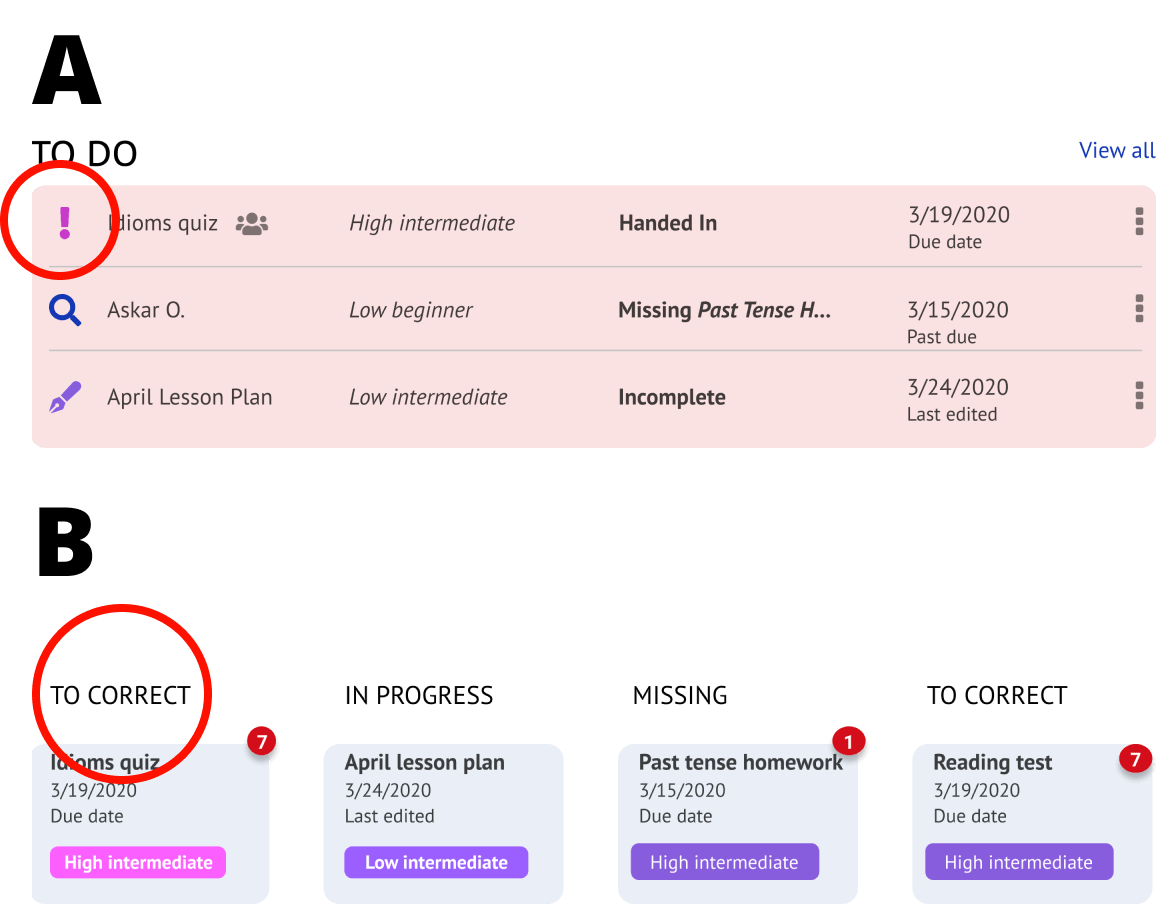
B was the unanimous winner. The icons were more straight-forward, and organizing by tasks was much more practical than having disparate tasks listed together.
The next test was about differentiating between levels.
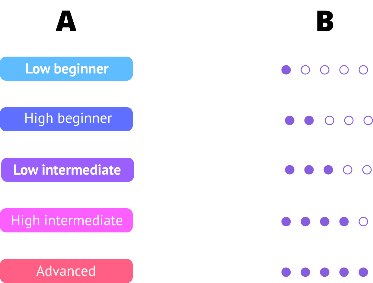
In this case, it was a 50/50 split between A and B. I ended up choosing B because of its minimal design, though A would certainly have evinced more levity.
The most important lesson I learned from this project was one of flawed assumptions. By ignoring the data and emulating products already in the market, I wasn't making decisions grounded in data.
This lesson also ties into the scope and purpose of the product. I’ve found that I lost sight of the original problem and the data that I gathered. In the future, I will lay a solid foundation and stick to the fundamentals before I let my imagination steer me off-course.
For future projects, I will spend more time on the first steps of the design process (research, user stories, user flows, and wireframes) before even considering the overall visual design. The beginning of the journey will inform the later parts. I think what’s key here is being patient and focusing on solving the core problems first and foremost.